
Tuesday, January 31, 2012
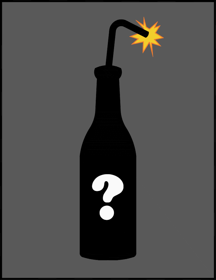
Day 30: EOD
I spent a little more time on the EOD design tonight. I think the arrangement is working. Threw some color in just to settle it down a bit. Don't take the color choices too seriously yet.

Monday, January 30, 2012
_SB_01142012+1.png)
Sunday, January 29, 2012
Day 28: EOD rework
Per request of my buddy, I have axed the wings. Today I spent some time reworking the banner and putting more emphasis on the lightning bolts.

Saturday, January 28, 2012
Day 27
I am back on the EOD design and I’m making some great
progress. I think I finally have the black line work done. I am currently
playing around with some “simplistic” shading techniques suggested by my friend
Max Grundy. I must say, I think I like it.

Basic line work

Simplistic shading
Friday, January 27, 2012
Day 26: Artist Highlight
This weeks’ “artist
highlight” is Paul Richardson from the UK. He’s more of a mastermind and
business man than artist as he has another guy by the name of Si Mitchell do
the art work. I just recently met him online and have been asking him a ton of questions.
He has a cool product line coming out next week on February 1st. I
asked if I could do an “artist” highlight and he was more than happy to provide
me with this little tidbit.
"If you like
breakfast, limited edition clothing or t-shirts packaged in juice cartons then
TBCLUB is the clothing brand for you!
TBCLUB (The Breakfast Club) is a UK based, limited edition, breakfast themed clothing brand with a difference. The brand is run by Paul Richardson and Si Mitchell who have a mutual dream to see clothing packaged in food boxes! A lot of thought, effort and time is put in to every aspect of the clothing brand. They do all the design work and screen printing themselves by hand and then package the items in to custom made food themed packets which relate to the design. All t-shirts sold are issued with a collectable recipe card, customer loyalty is then rewarded by issuing free gifts when specific recipe cards have been obtained.
Every item produced is limited to a specific quantity (such as 25 or 50), once it has sold out it will not be printed again. So, what are you waiting for? Head over to www.tbclub.co.uk now and join the club!"

Thursday, January 26, 2012
Day 25: Brainstorming
Tonight was all about brainstorming. I have this great idea
for a product line….I think. I don’t want to give too much information away,
but it’s going to be a ton of fun. So keep looking for hints and hopefully we
can start moving in the T-shirt direction before too long here.

Wednesday, January 25, 2012
Day 24: Back to the Vault
Unfortunately work is calling again tonight, so once again,
I am digging into the archive. This was done around the same time as the one I
posted Monday. However, unlike Monday’s, this one was mostly original. I say
mostly because I did look at resources for how to do the water droplets and I
think I loosed a mushroom or two. This was also created using colored pencil
which has always been one of my favorite mediums to work with.

Tuesday, January 24, 2012
Day 23: Back to the EOD
Tonight I spent some time working on the EOD design. Not
much changed from the last time except for the banner. I needed to find a way
to include all three words (Explosive Ordnance Disposal). I am really getting
excited about how it is coming out. The only part I haven’t decided on yet is
the wreath from the original design. I kind of want to include, but I don’t
want the design to get too busy. I am really excited to get some color into it.
Maybe there will be time tomorrow.

Newest

Older

Original
Monday, January 23, 2012
Day 22: Reaching into the vault again
I am reaching into the vault again tonight. This one was
done back in my wheel chair days. I had a lot of time on my hands so I used to
go to the mall and grab bunch of tattoo magazines. I would then go home and
just draw or recreate the tattoos on paper. The head was part of a larger
tattoo done by Joe Capobianco (I think).
It was such a cool looking face I decided to redraw it with colored
pencil and add the fire and spark elements on my own.I hope to get
back to my T-shirt stuff tomorrow if work isn’t too busy.

Sunday, January 22, 2012
Day 21: RDM take....?
I reworked the Roller Derby Manchester design a little bit. I like the direction it was going yesterday, but I just wasn't comfortable with the wheel. I changed it up a little, and feel much better about it now. I think all ties together a little more nicely.


Saturday, January 21, 2012
Day 20: Part 2 (Redesign Take 1)
Here is one idea for the redesign on the Roller Derby
Manchester logo. As you can see it is much simpler than before. I will try a
few other designs, but go ahead and give some feedback on this one.

Day 20: Part 1
I'm
pretty excited this morning. Its day 20 and I just went to check out my total
blog hits as of right now. We have 998. No doubt we will hit 1000 today. That's
1000 in 20 days! Now I know that vast majority of those are my family and friends
;). However, I would like to mention, we do have about 25 hits from Russia, 20
from the Ukraine, and then others from the UK, Germany, and South Korea. Thank
you all so much for taking an interest in this. I am excited to know that so
many of you want to venture through this journey with me.

Yeah……it’s
random.
Friday, January 20, 2012
Day 19: Artist Highlight (...errr recommendation)
If you haven’t yet done so, go check out the newest T-shirt
release over at Johnny Cupcakes. Talk about inspiration. I hope to do a full
review and highlight on this guy in the not so distant future. Just need to get
in contact with him first.


Thursday, January 19, 2012
Day 18: Back To The Drawing Board
Ok. I received an e-mail from the folks over at Roller Derby
Manchester (the web designer actually). It wasn’t what I was hoping for, but it
was kind, constructive, and helpful. Here is the email:
Bobby,
Bobby,
I can't speak for the team officially, but wanted to shoot an
email your way after briefly discussing your design with a couple of the
appropriate team members. I'm only responsible for the website, so
understand that I'm going to be completely biased toward that in my feedback.
I like the design overall. It's clean and identifiable, and
thankfully doesn't include pinup girls or wings or flash tattoo styled designs.
My suggestion would be simplifying it ruthlessly, though. I've included a few
examples of the simple, iconic type of design that would work best (again, at
least for the website). I know the management committee is planning to make
pins and stickers and such, and minimalistic designs tend to work best for
those as well.
I love the idea of using a crown for the 'queen city' but that
may cause confusion, since only people from NH will be familiar with the city's
nickname. Also, Buffalo NY has a team called the "Queen City Rollers"
so to further avoid confusion I would suggest avoiding using that nickname.
I'm also a big fan of the idea of using a skate wheel, even if
it is on the cliché side of things. It represents derby as a sport rather than
a spectacle, and gives a perfect opportunity to add text into the logo.
However, the "men, women, youth" text on your current design would
quickly become illegible if scaled down.
I've tried using ornate designs (similar to yours) for
branding/marketing in the past, but they tend to be very limited in what they
can be used for. As much as I like your design, I don't think it will be usable
in its current form. I hope this feedback is well received and ends up being
helpful, and I highly encourage you to send another submission, if you have
time to create one (or even more, perhaps?).
These are the examples they sent:

I wanted to show you the email because in the past that
would have crushed me. I would have taken this as a direct insult not matter
how kind the email. That’s the kind of thing that discouraged me from
continuing my pursuit of a Graphic Design degree. However, as I mentioned
before, I am approaching these things differently this time. It’s not about
being a success; it’s about not giving up. It’s about perusing my art as a
hobby regardless of the outcome. I still have a couple weeks before the design
contest deadline ends, and per their suggestion, I will definitely keep trying.
Wednesday, January 18, 2012
Day 17: Opening the Vault Again
Today was another one of those days when I find it hard to
get any design work done. I think this may end up being the trend for
Wednesdays. So once again, I am reaching into the vault and pulling out some
artwork from way back. This was done during the last art class I took back in
1999. There really isn’t anything fancy about it, but it’s one of my favorites.
If you know me at all, you’ll know that’s unusual. I very rarely like my work.
However, this one just always stuck out to me. It was done with pen and ink on Bristol
board and took only a day or two. It was an actual feather Sue had on her desk
and I was cramming to get this assignment done. I just sat down and did it one
weekend when we were visiting her folks. Maybe for now I’ll start calling
Wednesdays “Way Back Wednesdays.”


Tuesday, January 17, 2012
Day 16: Using the BIC
Tonight I decided to get away from the computer and go back
to my roots of using ball point pen. It’s probably one of my favorite things to
draw with. I took the design from last night and printed it with a very fine
line weight. This gave me a “template” to start sketching on. It took me several
tries, but I think it’s coming together. One of the areas I kept having issues
with was the banner. Yes, I like using and drawing banners. It’s one of those
elements I really want to master. After a few rounds of sketches I finally came
up with something I am happy with.


I really like the new direction of this design. It definitely
has the look and feel I was after. As usual, please feel free to offer any
input or critique.
Monday, January 16, 2012
Day 15: Now We're Talking
Tonight I worked on digitizing my sketches from last night. I am getting really excited about this now.
However I may or may not complete this design without jumping onto something else first. In my mind
the two will go hand in hand. For now though, this is what I have on the EOD design.

I do have other news tonight. I have officially created (rereleased) the Curbside Designs Fan Page on
Facebook. http://www.facebook.com/pages/Curbside-Designs-LLP/192516700231?sk=wall Please visit and give us a like. When you are finished, try prodding your friends to do the
same. This is where I see this venture gaining the most momentum. I plan on posting my blogs there
as well, so now anyone can offer input on designs. I look forward to getting even more feedback and
critique, the more the better. When I finally do release a product line, I want it to be as much yours as it
is mine. Your input will help make that happen.
Sunday, January 15, 2012
Day 14: Get The Creative Juices Flowing
I kind of felt the creative juices flowing tonight on the
EOD design. I went online and started searching for ideas and directions. After
finding some ideas that resembled the direction I wanted to go, I printed them
off and started sketching. This is what I came up with.

The color photos in the back are the examples I referred to and
the drawing in the middle is my sketch. Hopefully tomorrow I can start
digitizing it.
Saturday, January 14, 2012
Day 13: Part 2
I thought I might wet your appetite with a little teaser.
Shhhhh.....don't tell anyone.


Friday, January 13, 2012
Day 12: Artist Higlight
So it’s Friday again and it’s time for my weekly artist highlight. Earlier this week I had the privilege of corresponding with one of my favorite artist Max Grundy. I came across his stuff in a hot rod magazine a while back and decided to check out his website. I was instantly blown away. It was some of the coolest stuff I had ever seen. His style seems simplistic at first, but it’s not. It’s layered with fear based imagery and cool stuff that all has significant meaning. His tag line is “Fear is the New Beauty”. According to the artist statement on his website, “[his] work defuses the power that media has over our society. Media uses fear as a form of propaganda to control our actions, which makes it a powerful force”. Throughout the rest of his statement he explains this concept and how his art work helps to combat it. If you know me at all you know one of the things I despise the most is the media. That’s why not why I love Max’s work so much, but it is an added bonus.
Through our correspondence this week, I was able to share my current goal with him and how I was trying to get my own art thing going. He was kind enough to visit my blog and then offer some very helpful critique on the Roller Derby Design (look for an updated version tomorrow). In fact, I never knew it, but he used to be an art teacher. So he knows something about helping “frustrated” artist get their act together. Apparently there are a lot of us. Who knew?
Take the time to go and visit his website at http://www.maxgrundy.com/. I think you will quickly understand why I admire his work so much. Hopefully you will feel the same way I do. You will notice much of his stuff is for sale, including T-shirts and prints. I have purchased from him before and trust me, he will treat right. My wife had an issue with an order once, and he called her personally to make sure it was properly taken care of. While Sue had him on the phone, she asked if he wouldn’t mind signing our purchase. He humbly considered the request and was more than happy to do so. If I had a rating system for artists that went on a scale from 1 to 10, Sue would give him 10 and a hug. Below are some of my favorite examples of his work.


Thursday, January 12, 2012
Day 11: You have got to be kidding me!
Tonight was one of those nights when I feel really productive. I sat down and started working on the EOD T-shirt design. I was feeling really good. Things were just flowing in a really cool way. Finally I came up with this awesome outline.

Then I decided to move on to the coloring. That’s when it happened. You see, many times the coloring part is the most exciting. That’s the part that is supposed to bring your art to life. But not this time. I finished the coloring and went to preview it. This is what I saw.

I was horrified. I hate it. It’s week. It’s bland. It sucks. Now in the past this would be it for me. This was the very type of thing that would cause me to throw in the towel and walk away for about a decade or so. I can’t do that this time because I made up my mind to do it different. I think I am just going to walk away briefly and do some work on some other stuff. In a day or two I will take another look and see what I can do. In the mean time, do your worst. Let the critiques fly. I’m a big boy. I can take it. LOL
Wednesday, January 11, 2012
Day 10: Well....
So today was one of those days when you get up and don't stop until...well now. That being said, I have not had a chance to work on any new designs. However, I do have a few things to fill you guys in on.
First: I am going to put together a Curbside Designs Fan Page on Facebook. At that point all of my blog posts will also be posted in that location. This make will it possible for more people to post comments without signing up for a Blog Spot account. This should be set up by this weekend.
Second: I am going to start dropping subtle hints about a product line I am looking to create through out this year. So look for icons or images appearing here and there to give you clues. I don't want to give away too much too quick so you are going to have to look hard and use your imagination.
Since I like to post art work each day, and I have nothing new, I am reaching into my "vault". I am going way back to my college days when I was a starry eyed student dreaming of fame and fortune.....lol. This was something I did for my Typography class. We were tasked to display our name in a way that portrayed our personalities. This was what I came up with.

Tuesday, January 10, 2012
Day 9: Another Brainstorm Session
So tonight I spent some time brainstorming the logo/T-shirt idea for EOD. I had to stretch myself a little bit as there are some constraints. However I do think I have a direction. Next step is to get it start digitizing it and playing with size and special arrangement. It’s always interesting to see how much things change during this process. Now doubt by the time I am finished, it will be totally different.

On another note, I got some great feedback on the Derby logo yesterday from an artist who I have been following. This is very exciting because he has become someone I look up to and respect. I plan on doing an artist highlight on him Friday so I will tell you more about it then. Just know this; there are now a few more minor changes to make to the logo.
Monday, January 9, 2012
Day 8: One down, on to the rest.
So this is the final product for contest submittal. I changed a few more minor things. For example, I dropped the brass knuckles and did a “fancy” cut on the upper banners, I finally decided to go with the shading on the rays, and I eliminated the color white. The reason for eliminating the color white was to reduce the design to 3 colors. This was one of requirements for the contest. I had kind of gotten away from that, but in the end decided to honor the contest guidelines. Now we wait.

In the mean time I am working on some sketches for a T-shirt requested by a good friend of mine. It’s for the military EOD (Explosive Ordnance Disposal). There is an existing logo that I am using as a guideline.

However, I am permitted to rework it so long as I keep the original elements in my design (the bomb, the bolts of bolts, and the wreath). This is going to be fun because it will lead nicely into a line of T-shirts I want to do. My buddy and I have already gone back and forth a couple times and we are both excited about the direction this could go.
Thank you guys for your support and input so far. Help me continue to get the word out on what I am trying to do here. I am getting more and more ideas by the day.
Sunday, January 8, 2012
Day 7: A few changes

Day 7: Finished with this one (I think)
So this is it. I think I am done. The big change from yesterday is the rework of the lower banner. I thought the way the text is supposed to read would be less confusing this way. For now, I am going without shading on the stars rays.

If anyone has any last minute suggestions, feel free to shoot. My plan is to submit this design tomorrow. The contest deadline is February 1st so there is going to be a little bit of a waiting period. In the meantime, I am going to get started on a T-shirt design for an old college friend of mine. The design is going to be military themed, so it should be a fun one. I am excited to get going on T-shirts.
Saturday, January 7, 2012
Day 6: Part 3
Ok, here is my progress for today. I am almost done. The big change from this afternoon is the text on the wheel. I feel like it flows a lot better. I also added some highlights to some of the features and messed around with some of the coloring. Not sure about the brass knuckles up top. Thought I would give it a try. I would also like to try and figure something out for the stars rays. I keep feeling like their needs to be shading near the wheel, but I just can't get it to look right. Let me know what you guys think. Hopefully I'll wrap it up tomorrow.

Day 6: Part 2
So it’s noon time. I thought I’d give you guys a “progress print”. Colors are starting to come together. I definitely need to work with some of the line thicknesses and I also need to figure out some “shading” around the stars. The colors were predetermined by the Roller Derby league and the logo contest limitations mandate that only 2 to 3 colors be used. So far I am using Purple, Green, and Black. (I don’t think white counts, but we will see). Once again, I would love any feedback.

Day 6: Part 1
Hello everybody. I just wanted to check in this morning to lay down the plan for the day. As I pursue this T-shirt business, I intend to do the bulk of my work on the weekends. Today and tomorrow should allow me enough time to just about wrap up the Roller Derby design. So hopefully I will be able to share some periodic progress displays throughout the days.
For those of you who have stumbled across this blog and aren’t quite sure what it’s about, let me explain. I am spending 2012 pursuing a long time dream to start a T-shirt design small business. I am giving myself 365 days. On January 1st 2013 I will review my progress and determine if I have what it takes to be a T-shirt designer. Either way, I will finally know and can stop saying “one day” or “if only”. I am asking for people to spread the word and help me get as many followers as possible. I want feedback throughout this adventure and I want it to come from a broad demographic.
For those of you who have stumbled across this blog and aren’t quite sure what it’s about, let me explain. I am spending 2012 pursuing a long time dream to start a T-shirt design small business. I am giving myself 365 days. On January 1st 2013 I will review my progress and determine if I have what it takes to be a T-shirt designer. Either way, I will finally know and can stop saying “one day” or “if only”. I am asking for people to spread the word and help me get as many followers as possible. I want feedback throughout this adventure and I want it to come from a broad demographic.
So, let the creative work begin. For now, I will leave you with this motivational video. Let it inspire you to also pursue your dreams.
Friday, January 6, 2012
Day 5: Artist Highlight
So I’m getting this post out a little earlier than I have the previous days. Part of that is because for the next six weeks, my evenings will be spent taking my two oldest sons to snowboard lessons. The other part is that I am going to try posting my blogs around noon time. I think it will be a little easier for people to keep up with them.
Since my Friday evenings are booked for the next six weeks, Friday’s are going to be hard to get any design work done. So for the next six Friday’s I am going to share some of my favorite artists, or those who inspire me. It gives you guys a chance to take a peek at what makes me tick. This week, the artist I would like to introduce is a guy that goes by Hamilton. His website http://artbyhamilton.com/ displays a lot of his work and style. For example:


I found this guy years ago on line. The moment I saw his work I fell in love with it. I have contacted him a few times through e-mail and he is really cool and down to earth (and humble). The reason I like his work so much is because of the rockabilly, hot rod, and tattoo influences he uses. At first his stuff seems random and chaotic, but the more you look at it, you see how well it ties together. Every bit of it screams rebels and fast cars. As best I know, he mostly paints one of a kind wood plaques and signs for businesses. He also sells a lot of his stuff either as the original wood plaque or as a reproduction print. Although he does have T-shirts for sale showing his artwork, I wouldn’t consider him a T-shirt designer. He’s a fine artist and I love his work. It definitely influences my own style as I pursue my T-shirt venture.
Thursday, January 5, 2012
Day 4: Redesign
So I got some great feedback on Day 3’s “Dilemma” post. Some of you said “keep what you have, it isn’t that close.” Others of you said to “go with your gut and do a redesign.” In the end, I kind of did both. I hung on to the elements I really loved and changed the ones that bothered me. The conclusion is what you see here.

The biggest change was the removal of the skates. I got it in my head that they needed to be there. However, the more research I did, the more I found that to be very cliché. Almost every Roller Derby logo has a skate in it, so it wasn’t going to be original no matter what I did. I also opted out of the fist. While I did feel it portrayed the “aggression” typically associated with Roller Derby, I felt it was a little forced and lacked a smooth tie-in to the rest of the composition.
What I did decide to do was turn my “shield” into a wheel (some of you already thought it was a wheel). This allowed me to incorporate some text on the wheel without it looking out of place. The other element I added was the shooting stars coming out. I decided that instead of aggression, I wanted to portray energy. I recently watched some Roller Derby documentaries, and the one thing that struck me was the level of energy associated with these events. I think it out weighed the stereotypical aggression (or at least was the catalyst).
What I did decide to do was turn my “shield” into a wheel (some of you already thought it was a wheel). This allowed me to incorporate some text on the wheel without it looking out of place. The other element I added was the shooting stars coming out. I decided that instead of aggression, I wanted to portray energy. I recently watched some Roller Derby documentaries, and the one thing that struck me was the level of energy associated with these events. I think it out weighed the stereotypical aggression (or at least was the catalyst).
Finally, I decided to keep the banner and crown. The banner is just my personal style. I kind of like to use some tattoo influences in my designs, and nothing says tattoo like banners. Also, the crown just had to stay. Manchester, NH is the queen city.
All in all I am pretty happy with it. The next step is to start dressing it up with color. I will also tweak some of the text. Please feel free to continue offering your input. It has been very helpful and especially encouraging.
Wednesday, January 4, 2012
Day 3: Dilemma
So for this post, I worked on getting my design digitized. I felt really good about what I had gotten done. I was actually getting on that “artistic high”. Was…. This is a screen shot of the line work in the program I’ve been using.

Here’s the rub. Whenever I design stuff I usually look around for inspiration. Especially when it’s a subject I know little about (like roller derby). One of the places I love to look is a website called istock photo. They have tens if not hundreds of thousands of photos and clip art. Almost any genre you can imagine. The cool thing is that they are royalty free. Meaning there is no copyright issue (assuming you purchase the image). So I searched for “Roller Derby” and found some great reference material. However, I also found this…

Yeah, it’s uncomfortably similar to what I’ve done. A lot of that reason is because I was going for a crest type of design because Manchester is the Queen City. By nature crest designs tend to be the similar. You have the center “shield”, objects flanking either side of that shield (lions perhaps), a crown at top, and some sort of banner. Google “crest” or “family crest” and you will see what I am talking about. So I’m not worried about looking like I copied someone. However, I am a little bummed out about how unoriginal it feels now. So the problem is this: do I go forward with this design, or do I trash it and start fresh? The purist in me says trash it, but at the same time, I was so excited about how it was coming together.
Any thoughts?
Tuesday, January 3, 2012
Day 2
Yesterday I showed some of my “brain storming” drawings. Tonight I spent some time pulling them together into some sort of arrangement. (Notice the drawing on the pad to the right)

I like where it’s going so far. However the sketch is a bit rough. It’s not a great composition and spatially it is struggling a little bit. The next step is to start scanning and digitizing the drawing. This will allow me the ability to better arrange certain features as well as resize them easily. It saves me a lot of hand drawing.
One of the main areas I’m struggling with right now is the text placement. The contest guidelines request certain text to be displayed. For example, the want Manchester Roller Derby, Men, Women, Kids, and the acronym MRD all displayed. I definitely need to spend some time on this as it is the most important part of the logo.
Well this is it for my blog post tonight. I could use the rest the time tonight to work on this design. Thank you all for your support so far. Don’t forget, I could really use some input. I only “kind of” know what I’m doing (By “kind of” I mean I’m faking it). Also, some folks have mentioned difficulty on posting comments to the blog. I am looking into. For now feel free to comment through Facebook or Google +.
Monday, January 2, 2012
Day 1
So the today is the day I decide to do it. I just announced my venture on Facebook and already I'm getting some feed back. Very exciting. The idea here is to document my T-shirt venture every step of the way. I will need to learn how to blog, design, market, sell, and well....everything else associated with starting a small retail business.
Just to clear things up. This is for fun. I have great job and career and as of right now and I plan to keep going with that. This T-shirt business is intended to be an artistic outlet. A way to express myself creatively while making a small business venture out of it. Some of this falls from the frustration of never being able find the "perfect" t-shirt or finding them and thinking "I could have done that."
One of my biggest goals is to post a blog every day for 365 days. With each post I would like to display some of my art work. I will be looking for feed back. I want the good and the bad. I can't grow as an artist if I don't know what I'm doing wrong. So be honest. I look forward to it.
In addition to my daily blog posts, I will also try and document the entire process of t-shirt design, production, marketing, and sales. This whole thing is going to be a learning experience for me. Please join me as I stumble through it. We can all have a nice big laugh at my expense.
Well I think that is enough information for now. I will leave you all with this attached image displaying something I am currently working on. It's a design contest for a semi local Roller Derby Team.

Subscribe to:
Comments (Atom)